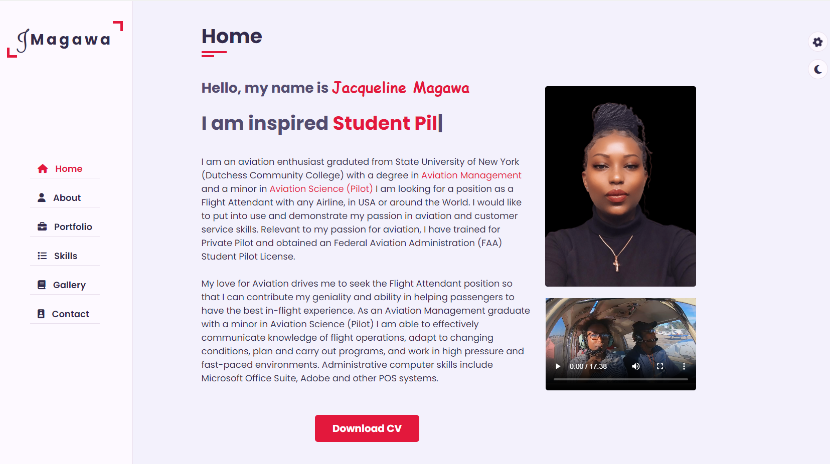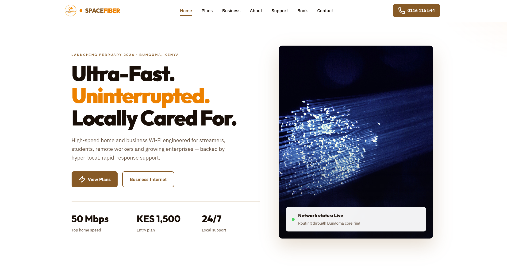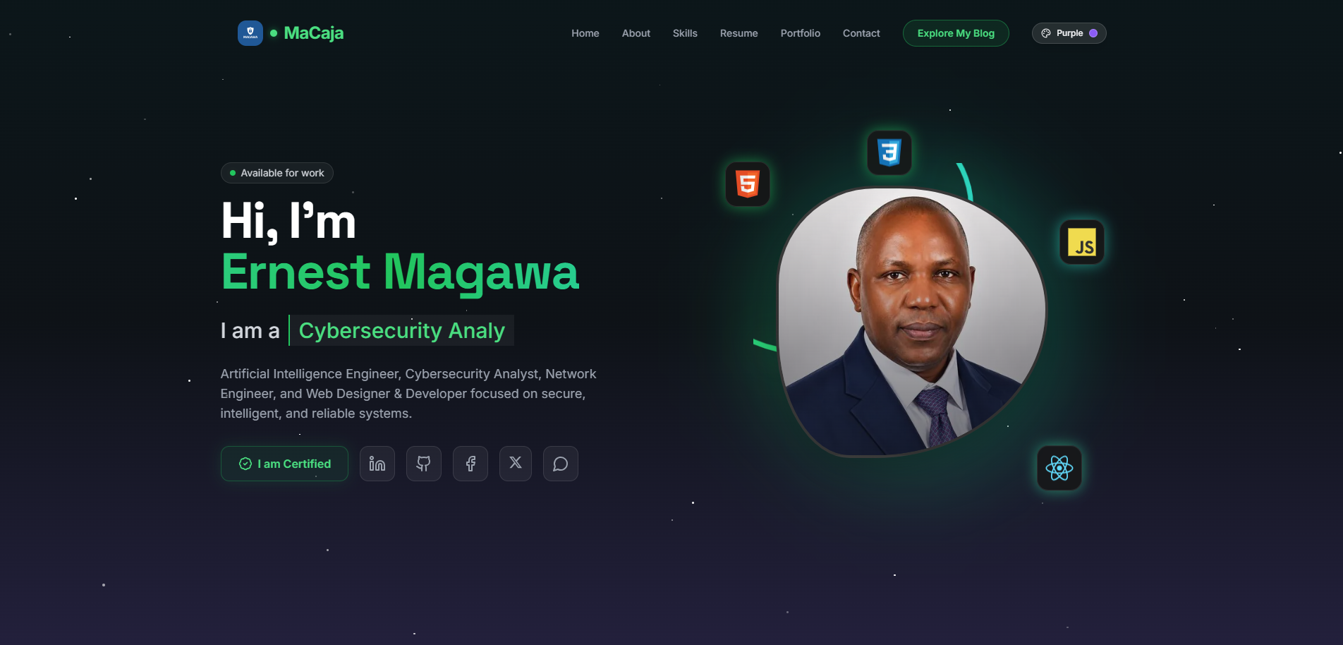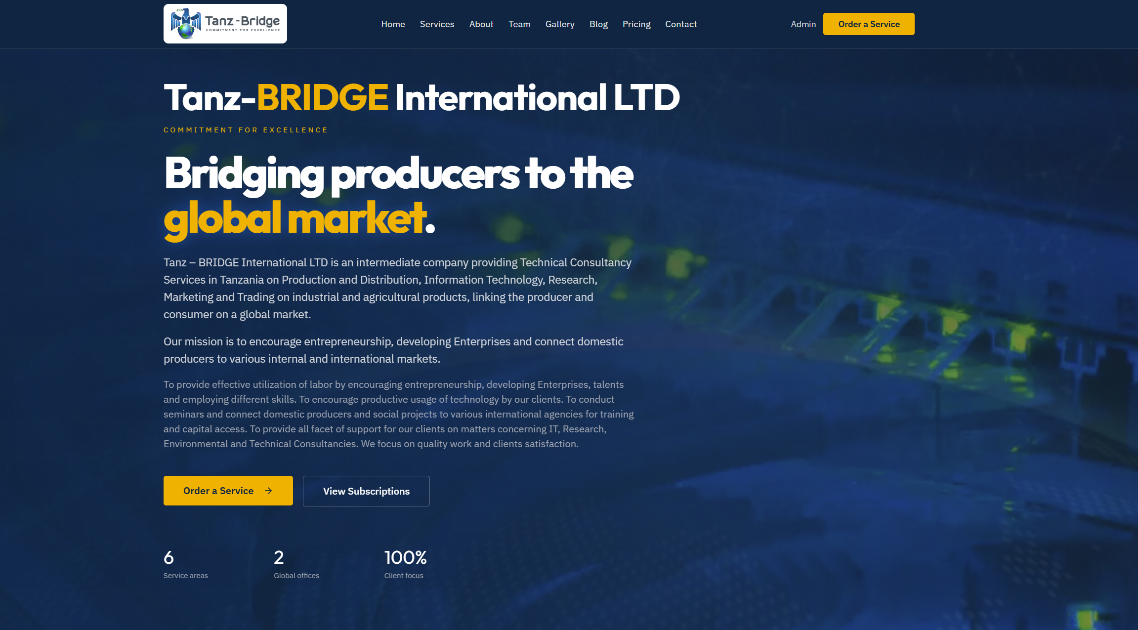
From Design to Build: Jacqueline Personal Portfolio Website
Responsive Personal Website Development
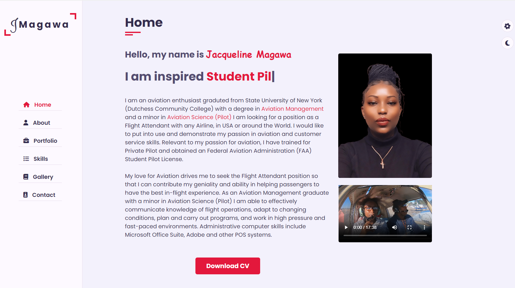
Why the jump from design to development matters
A website is more than a mockup brought to life. The move from design to web development is where ideas become usable, responsive, and accessible experiences for real people.
Many projects look polished in static design files but lose clarity once they reach the browser. Spacing behaves differently, content grows, devices vary, and interactions need to feel natural. The transition phase is where these challenges are solved.
Good web development does not replace design. It extends it. A strong developer translates visual intent into structure, behavior, and performance without losing what made the original concept effective.
Design is not the final product
Design tools are excellent for planning layout, hierarchy, branding, and flow. But a finished screen in Figma, Adobe XD, or Sketch is still only a reference point.
A real website must handle:
- different screen sizes
- inconsistent content lengths
- user interaction states
- browser differences
- loading speed constraints
- accessibility needs
- search engine visibility
This is why development should not be treated as a separate afterthought. The best results happen when design decisions are made with implementation in mind.
The stages from design to web development
The process usually moves through several connected steps. These may vary by team, but the overall flow is similar.
1. Understanding the design system
Before writing code, the developer studies the design and identifies reusable patterns.
This often includes:
- color palette
- typography scale
- spacing rules
- buttons and form styles
- cards, sections, and navigation patterns
- responsive behavior
- interaction states such as hover, focus, and active
At this stage, the goal is to avoid building each page as a one-off layout. Instead, the developer starts thinking in components.
2. Converting layout into semantic HTML
The next step is building the structure with meaningful HTML. This is one of the most important parts of the transition.
A design may show a hero section, feature grid, pricing cards, and footer. In code, those become semantic building blocks such as:
<header>
  <nav>
    <a href="/">Brand</a>
    <ul>
      <li><a href="#features">Features</a></li>
      <li><a href="#pricing">Pricing</a></li>
      <li><a href="#contact">Contact</a></li>
    </ul>
  </nav>
</header>

<main>
  <section id="hero">
    <h1>Build faster with a modern workflow</h1>
    <p>Launch responsive websites with clean design and reliable performance.</p>
    <a href="#pricing">Get Started</a>
  </section>
</main>
This structure helps:
- screen readers interpret the page
- search engines understand content hierarchy
- developers maintain the code more easily
3. Styling with CSS
Once the structure is in place, styling brings the design closer to the intended look and feel.
Modern CSS makes it easier to recreate complex layouts while keeping the code maintainable. Common tools include:
- Flexbox for alignment
- Grid for multi-column layouts
- custom properties for theme consistency
- media queries for responsiveness
- transitions for subtle interaction feedback
For example:
:root {
  --primary: #2563eb;
  --text: #1f2937;
  --bg: #ffffff;
  --space: 1rem;
}

body {
  font-family: Inter, sans-serif;
  color: var(--text);
  background: var(--bg);
  margin: 0;
}

.hero {
  display: grid;
  gap: var(--space);
  padding: 4rem 1.5rem;
  text-align: center;
}
The goal is not just visual accuracy. It is also consistency, readability, and scalability.
4. Making the design responsive
A static design often shows desktop and mobile versions, but real responsiveness is more dynamic than switching between two screens.
Web development must account for:
- tablets and small laptops
- landscape and portrait orientations
- edge cases between breakpoints
- flexible content blocks
- navigation behavior on smaller screens
Responsive development is less about forcing fixed layouts and more about creating systems that adapt naturally.
5. Adding interaction with JavaScript
Not every website needs heavy interactivity, but most modern sites need some level of dynamic behavior.
Examples include:
- mobile navigation toggles
- form validation
- tabbed content
- image sliders
- theme switching
- asynchronous content loading
A simple example:
<button id="menu-toggle" aria-expanded="false">Menu</button>
<nav id="mobile-menu" hidden>
  <a href="#about">About</a>
  <a href="#services">Services</a>
</nav>
const toggle = document.getElementById('menu-toggle');
const menu = document.getElementById('mobile-menu');

toggle.addEventListener('click', () => {
  const isOpen = toggle.getAttribute('aria-expanded') === 'true';
  toggle.setAttribute('aria-expanded', String(!isOpen));
  menu.hidden = isOpen;
});
This is where design starts to feel alive. Motion, feedback, and state changes all contribute to the user experience.
Bridging the gap between visual design and code
The biggest challenge is not writing code. It is translating intent.
A designer may choose a larger heading to create emphasis. A developer has to decide:
- what semantic tag it should use
- how it scales on smaller screens
- how line breaks behave
- how spacing changes with adjacent elements
The same applies to buttons, cards, forms, and navigation. Every visual choice creates technical questions that need practical solutions.
This is why front-end development works best when it combines:
- attention to detail
- strong understanding of layout systems
- accessibility awareness
- problem-solving under constraints
Common issues during handoff
The handoff from design to development can fail when assumptions are left unclear. Some of the most common problems include:
Incomplete states
Design files may show only the default version of a component, but a real site needs more.
Missing states often include:
- hover
- focus
- disabled
- error
- success
- empty
- loading
Unrealistic spacing or content
Placeholder text can hide layout problems. Real content is usually messier.
For example:
- headings may wrap unexpectedly
- product names may be too long
- user-generated content may break card layouts
- translated text may take more space
Pixel perfection over usability
Trying to match every pixel exactly can hurt maintainability and responsiveness. The browser is not a design canvas with fixed dimensions. It is a fluid environment.
A better goal is functional fidelity:
- preserve hierarchy
- keep spacing balanced
- maintain branding
- respect accessibility
- adapt gracefully to different devices
Accessibility should begin in the transition phase
Accessibility is often added too late, when it should be part of the move from design to development.
This includes:
- semantic HTML
- sufficient color contrast
- visible focus states
- keyboard navigation
- descriptive link text
- proper form labels
- ARIA only when necessary
For example, a button that looks clean in a mockup still needs clear focus behavior in the browser:
button:focus-visible,
a:focus-visible {
  outline: 3px solid #2563eb;
  outline-offset: 2px;
}
A website that looks modern but is difficult to navigate is not truly finished.
Performance is part of implementation quality
A beautiful design can lose value if the final site loads slowly. Development adds responsibility for performance, especially on mobile networks and lower-powered devices.
Important considerations include:
- optimized images
- minimized CSS and JavaScript
- lazy loading where appropriate
- efficient font loading
- reducing render-blocking assets
- avoiding unnecessary animation libraries
Performance affects:
- user satisfaction
- bounce rate
- accessibility
- search rankings
- conversion rates
In practice, good development means protecting the design from technical bloat.
Tools that help the process
The transition from design to development is easier with the right workflow and tooling.
Useful tools often include:
- Figma for design inspection and collaboration
- VS Code for development
- Git and GitHub for version control
- browser developer tools for debugging
- CSS frameworks or utility systems when appropriate
- component libraries for consistency
- Lighthouse for performance and accessibility checks
The exact stack matters less than having a repeatable process.
Thinking in components instead of pages
One of the biggest mindset shifts in web development is moving from full-page visuals to reusable interface pieces.
Instead of treating every page as unique, developers break the design into components such as:
- headers
- navbars
- hero sections
- cards
- testimonials
- forms
- footers
This approach improves:
- consistency
- development speed
- maintainability
- scalability for future updates
It also fits well with modern frameworks such as React, Vue, and Next.js, where components are central to the workflow.
Collaboration produces better websites
The design-to-development process is strongest when it is collaborative rather than linear.
Developers should ask questions like:
- What happens when this text gets longer?
- How should this section behave on tablet screens?
- Is this animation essential or optional?
- What is the keyboard interaction for this element?
- Are there alternative states for empty data?
Designers, in turn, benefit from understanding implementation limits and browser behavior.
When both sides communicate early, the final website usually becomes:
- more consistent
- easier to maintain
- more accessible
- better performing
- closer to the original vision
A practical workflow example
A simple workflow from concept to launch might look like this:
- Review wireframes and visual mockups
- Identify reusable components
- Build semantic HTML structure
- Apply base styles and design tokens
- Implement responsive layout behavior
- Add interactivity and dynamic states
- Test accessibility and keyboard navigation
- Optimize performance
- QA across browsers and devices
- Deploy and monitor
This process keeps the project grounded in both design quality and technical reliability.
Final thoughts
From design to web development is not just a conversion task. It is a translation process that turns static visuals into living systems.
The best websites succeed because the implementation respects the design while improving it through structure, responsiveness, accessibility, and performance.
A good developer does more than recreate what was drawn. They build something that works for users in the real world.
If the design defines the vision, development delivers the experience.