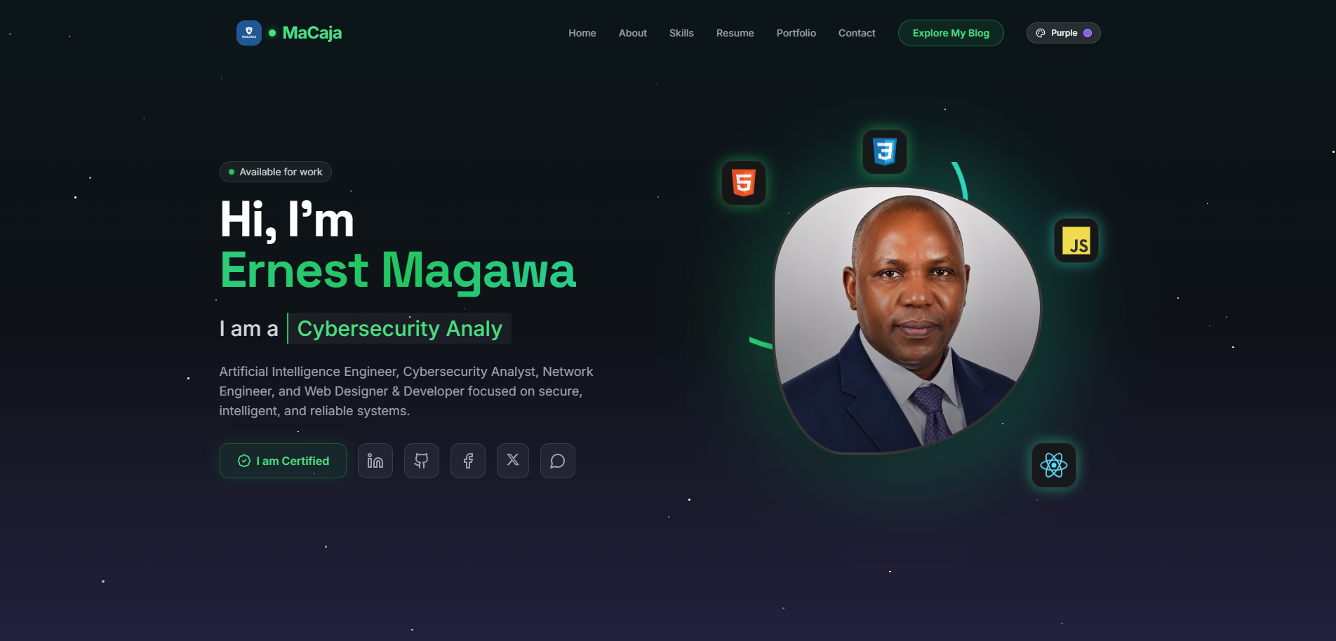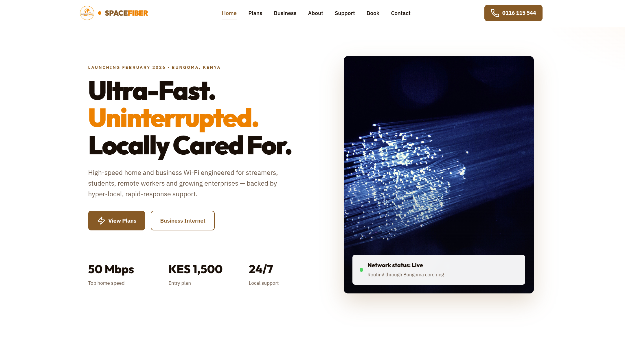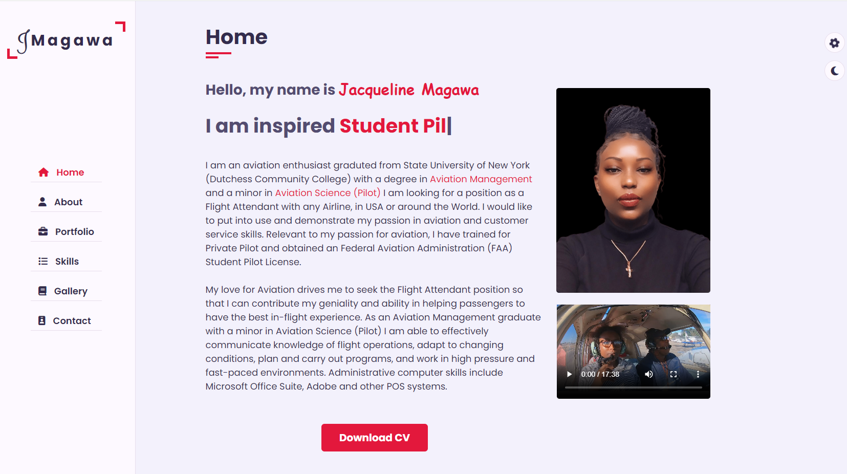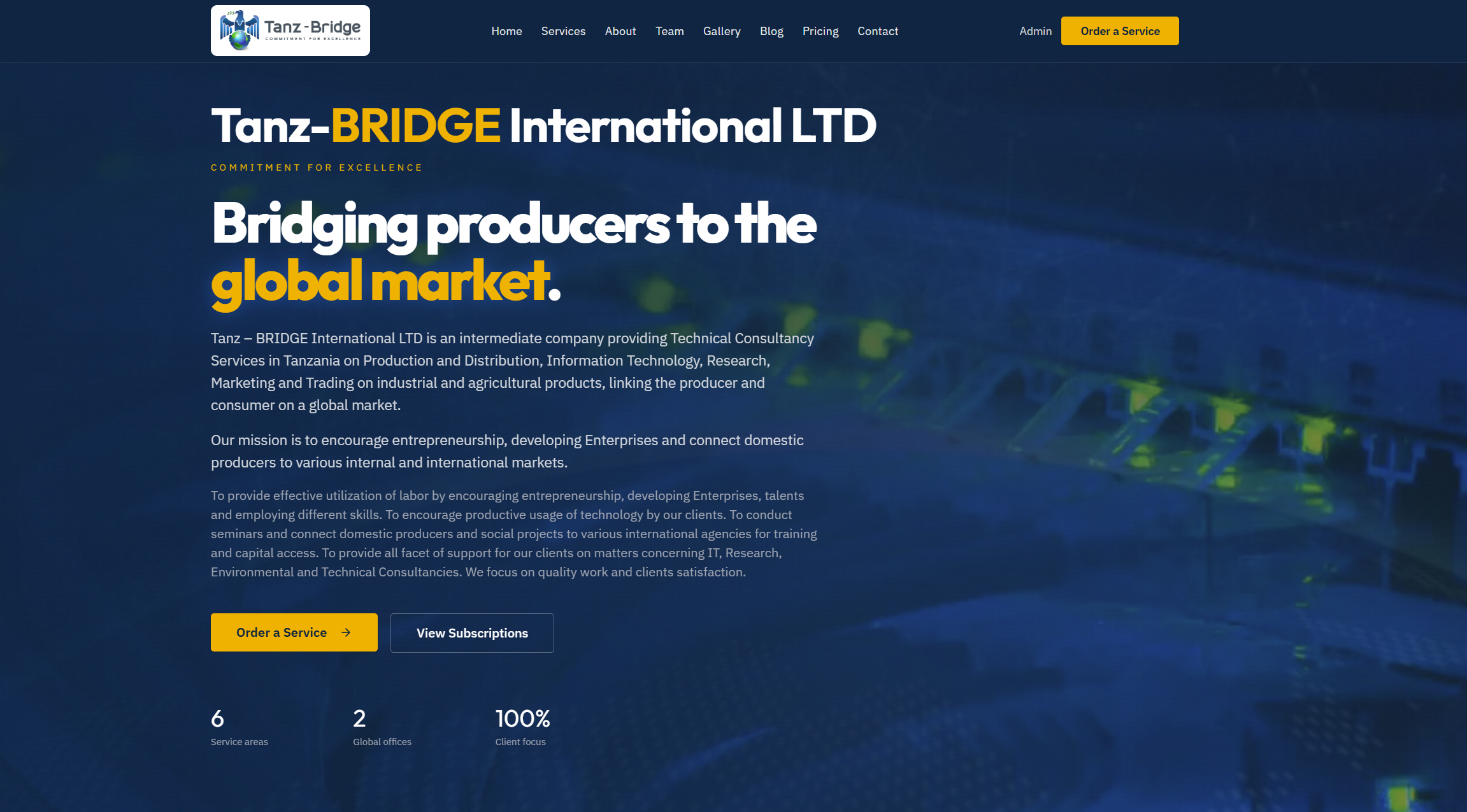
From Design to Build: Personal Portfolio Website
Personal Portfolio: AI, Networking, Web Development & Cybersecurity
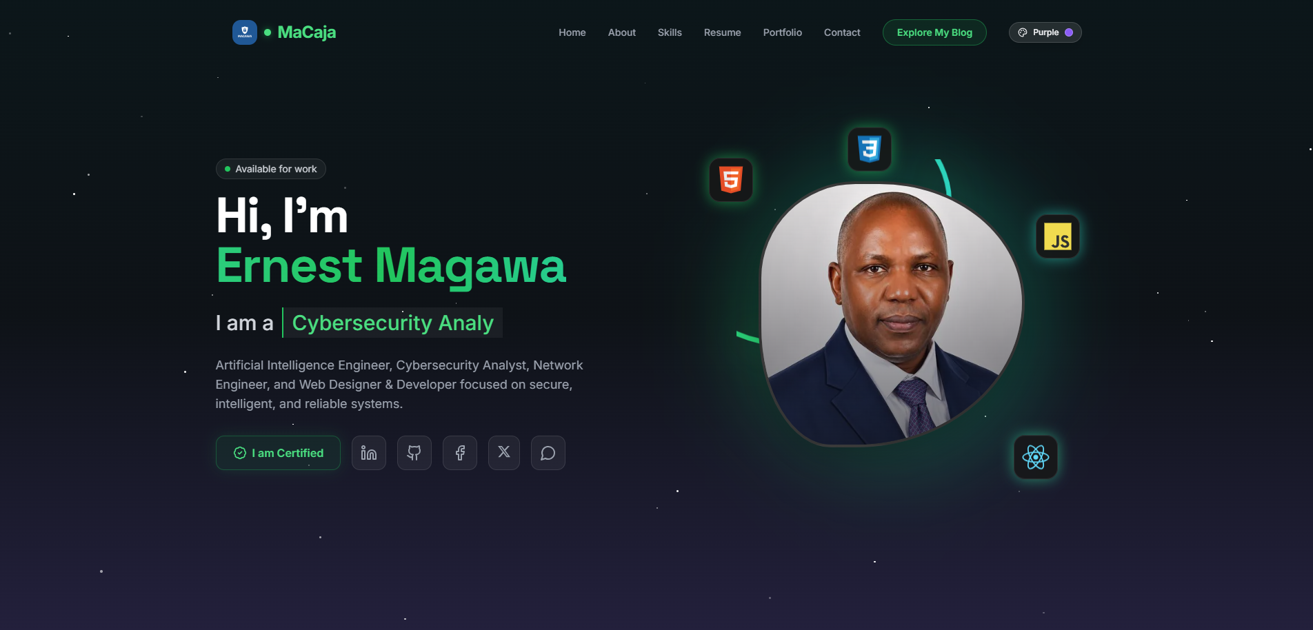
Turning design into a working website
The first stage of a web project is often focused on ideas: layout sketches, user journeys, color systems, typography, and content structure. The second stage is where those ideas become real. This is the point where design moves into implementation, and a visual concept turns into a functioning website.
Website Development II is about building. It covers the practical work required to transform approved designs into pages, components, and interactive features that users can actually navigate. This stage sits between planning and launch, and it is where technical quality starts to shape the final user experience.
A good design can still fail if the build process is rushed or inconsistent. Clean implementation matters because it affects:
- performance
- accessibility
- maintainability
- responsiveness
- SEO readiness
- long-term scalability
Starting with the design handoff
Before writing code, the development process begins with understanding the design handoff. This means reviewing mockups, prototypes, style guides, and content requirements in detail.
At this stage, the goal is to answer questions such as:
- What pages need to be built?
- Which elements repeat across the site?
- What components should be reusable?
- How should the layout behave on mobile, tablet, and desktop?
- What interactions are purely visual, and which require JavaScript?
- Are there accessibility requirements already defined?
A careful handoff reduces rework later. It also helps identify missing details early, such as hover states, form validation messages, or spacing behavior on smaller screens.
Breaking the interface into components
Modern website development works best when the interface is treated as a system of reusable parts rather than a collection of isolated pages.
Instead of coding each page from scratch, developers usually separate the UI into components such as:
- navigation bars
- hero sections
- cards
- buttons
- forms
- footers
- content grids
- alerts and banners
This component-based approach makes development faster and more consistent. It also improves maintainability, because updates can be made in one place and reused across the site.
For example, a simple card component might begin like this:
<article class="card">
  <img src="image.jpg" alt="Preview image">
  <div class="card-content">
    <h3>Project Title</h3>
    <p>Short description of the project or article.</p>
    <a href="#" class="button">Learn More</a>
  </div>
</article>
And the corresponding CSS could define the visual structure:
.card {
  background: #fff;
  border-radius: 12px;
  overflow: hidden;
  box-shadow: 0 8px 20px rgba(0, 0, 0, 0.08);
}

.card-content {
  padding: 1rem;
}

.button {
  display: inline-block;
  padding: 0.75rem 1rem;
  background: #1d4ed8;
  color: white;
  text-decoration: none;
  border-radius: 8px;
}
Even in a small example, the pattern is clear: define structure first, then style, then make it reusable.
Building the layout foundation
Once components are identified, the next step is creating the overall layout system. This includes containers, spacing rules, responsive breakpoints, and page structure.
A solid layout foundation usually addresses:
- consistent margins and padding
- grid or flexbox behavior
- responsive resizing
- readable content width
- alignment across sections
- visual hierarchy
CSS Grid and Flexbox are commonly used to create these structures efficiently.
Here is an example of a responsive content grid:
.grid {
  display: grid;
  grid-template-columns: repeat(auto-fit, minmax(260px, 1fr));
  gap: 1.5rem;
}
This kind of setup allows content blocks to adapt naturally across screen sizes without creating unnecessary complexity.
A predictable layout system prevents visual inconsistencies and helps the website feel polished across devices.
Converting visual design into semantic HTML
One of the most important steps in building a website is translating the design into semantic HTML. This is not just about matching the appearance of the mockup. It is about giving the content proper structure and meaning.
Semantic HTML improves:
- accessibility for screen readers
- SEO through clearer content structure
- maintainability for future developers
- browser consistency
For example, a section of a page should use the right structural elements:
<header>
<nav aria-label="Main navigation">
<ul>
<li><a href="/">Home</a></li>
<li><a href="/about">About</a></li>
<li><a href="/projects">Projects</a></li>
</ul>
</nav>
</header>
<main>
<section>
<h2>Featured Work</h2>
<p>Recent projects and case studies.</p>
</section>
</main>
<footer>
<p>© 2026 My Portfolio</p>
</footer>
A design may show boxes, text, and images, but developers must interpret those visuals correctly in code. Good structure is invisible to most users, yet essential to the quality of the site.
Styling with consistency in mind
Once the HTML structure is in place, styling brings the design to life. This includes colors, typography, spacing, shadows, borders, transitions, and responsiveness.
Consistency matters more than visual flair. A site feels professional when repeated patterns behave the same way everywhere.
Useful styling practices include:
- defining design tokens for colors and spacing
- using shared utility classes where appropriate
- keeping typography scales consistent
- limiting unnecessary custom variations
- organizing CSS by component or layout role
For example, CSS custom properties can help maintain consistency:
:root {
  --color-primary: #1d4ed8;
  --color-text: #1f2937;
  --color-background: #f8fafc;
  --space-sm: 0.5rem;
  --space-md: 1rem;
  --space-lg: 2rem;
  --radius-md: 10px;
}

body {
  color: var(--color-text);
  background: var(--color-background);
  font-family: system-ui, sans-serif;
}
This approach makes later revisions much easier. If the brand color changes, one variable can update the entire site.
Adding interactivity carefully
Most websites need some level of interactivity, but not every design element requires complex scripting. In Website Development II, the focus should be on useful interactions that improve usability rather than effects that slow the site down.
Common interactive features include:
- mobile navigation menus
- accordions and tabs
- form validation
- modals
- image sliders
- theme toggles
- dynamic filtering
A simple mobile menu toggle might look like this:
<button class="menu-toggle" aria-expanded="false" aria-controls="main-menu">
  Menu
</button>

<nav id="main-menu" hidden>
  <ul>
    <li><a href="/">Home</a></li>
    <li><a href="/services">Services</a></li>
    <li><a href="/contact">Contact</a></li>
  </ul>
</nav>
const toggleButton = document.querySelector('.menu-toggle');
const menu = document.querySelector('#main-menu');

toggleButton.addEventListener('click', () => {
  const expanded = toggleButton.getAttribute('aria-expanded') === 'true';
  toggleButton.setAttribute('aria-expanded', String(!expanded));
  menu.hidden = expanded;
});
This is a small example, but it shows an important principle: interactive features should work clearly, predictably, and accessibly.
Making responsiveness a core requirement
Responsive design is not a final adjustment. It should be part of the build process from the start.
A website must work across:
- large desktop monitors
- laptops
- tablets
- mobile phones
- different browser widths
- varying input methods
Common responsive considerations include:
- stacking columns on smaller screens
- resizing typography appropriately
- adjusting navigation behavior
- ensuring touch-friendly button sizes
- preventing horizontal overflow
- optimizing image scaling
A frequent mistake is building only for desktop and trying to “shrink” the layout later. A better approach is to think in flexible patterns from the beginning.
For example:
.hero {
  display: grid;
  grid-template-columns: 1fr;
  gap: 2rem;
}

@media (min-width: 768px) {
  .hero {
    grid-template-columns: 1fr 1fr;
  }
}
This lets the layout grow naturally as screen space increases.
Accessibility during the build phase
Accessibility should be part of development, not an afterthought added near launch. During the building stage, developers have direct control over many of the factors that affect usability for people with disabilities.
Important accessibility checks include:
- proper heading order
- keyboard navigation support
- visible focus states
- sufficient color contrast
- descriptive link text
- form labels and error messages
- meaningful alt text for images
- ARIA usage only when necessary
For example, focus styling should never be removed without providing a replacement:
a:focus,
button:focus {
  outline: 3px solid #f59e0b;
  outline-offset: 2px;
}
Accessible development improves the site for everyone, not only for users with permanent disabilities. It also benefits mobile users, keyboard users, and people in constrained environments.
Performance matters while building
Website quality is not only about appearance. A site that looks great but loads slowly creates friction immediately.
Performance should be considered during development through decisions such as:
- compressing and sizing images properly
- minimizing render-blocking resources
- limiting heavy animations
- reducing unused CSS and JavaScript
- loading assets efficiently
- avoiding unnecessary third-party scripts
Even simple choices can make a difference. For example, using modern image formats and lazy loading can help reduce initial load time:
<img
  src="project-preview.webp"
  alt="Project preview"
  loading="lazy"
  width="800"
  height="600">
Building with performance in mind creates a better experience and often improves search visibility as well.
Testing throughout the build
Development should not wait until the end for testing. Every major page, component, and interaction should be checked during implementation.
Useful testing areas include:
- cross-browser behavior
- responsive layout checks
- accessibility audits
- broken links
- form behavior
- visual consistency
- performance measurements
Testing can be done through a mix of manual and automated methods. Examples include:
- browser developer tools
- Lighthouse audits
- keyboard-only navigation
- screen reader spot checks
- device emulation
- real device testing where possible
Catching issues early saves time. A small layout bug in one reusable component can quickly affect many pages.
Keeping the codebase maintainable
A website build is not just for launch day. It must remain understandable and editable in the future. That means writing code that other developers, or even your future self, can work with confidently.
Maintainability often depends on:
- clear file organization
- reusable component patterns
- predictable naming conventions
- comments only where necessary
- avoiding duplicated logic
- separating structure, style, and behavior cleanly
A maintainable project usually feels calmer to work on. Changes are easier, bugs are easier to isolate, and growth becomes less risky.
For example, a simple folder structure might look like this:
project/
├── assets/
│   ├── css/
│   ├── js/
│   └── images/
├── components/
├── pages/
└── index.html
The exact structure can vary, but the principle stays the same: organize the project so it can scale.
Bridging development and content
A build is not complete just because the layout works. Real websites depend on real content. During this phase, developers often need to make sure that components behave correctly with actual headlines, body text, images, and links.
This step helps reveal issues such as:
- text overflow
- inconsistent image dimensions
- awkward spacing with short or long content
- poor readability on smaller screens
- weak hierarchy when content changes
Placeholder text may look neat in a mockup, but real content rarely behaves so perfectly. Building with realistic samples creates a stronger final result.
Preparing for the next stage
By the end of Website Development II, the design should no longer be a static idea. It should exist as a working, testable, responsive implementation.
At this point, the website should have:
- core layouts completed
- reusable components built
- styling applied consistently
- interactivity functioning
- responsive behavior verified
- accessibility reviewed
- performance considered
- content integrated or prepared
This creates a strong foundation for the next phase, which usually includes refinement, deployment preparation, final QA, and launch tasks.
Final thoughts
From design to building, the second stage of website development is where intention becomes execution. It is not just about coding pages until they resemble a mockup. It is about building a site that is structured well, performs reliably, adapts across devices, and remains usable for real people.
A successful website build combines visual accuracy with technical discipline. When development is handled carefully, the result is more than a finished interface. It becomes a dependable product that is ready for testing, growth, and eventual release.