
From Design to Build: Jacqueline's Personal Portfolio Website
How do you build one portfolio for someone who is both an aviation-trained Student Pilot and a rising cybersecurity engineer? This is the full design-to-build story of jacqmagawa.com — the throughline, the logbook-style flight timeline, the galleries, and why a hand-built static site was the right call.
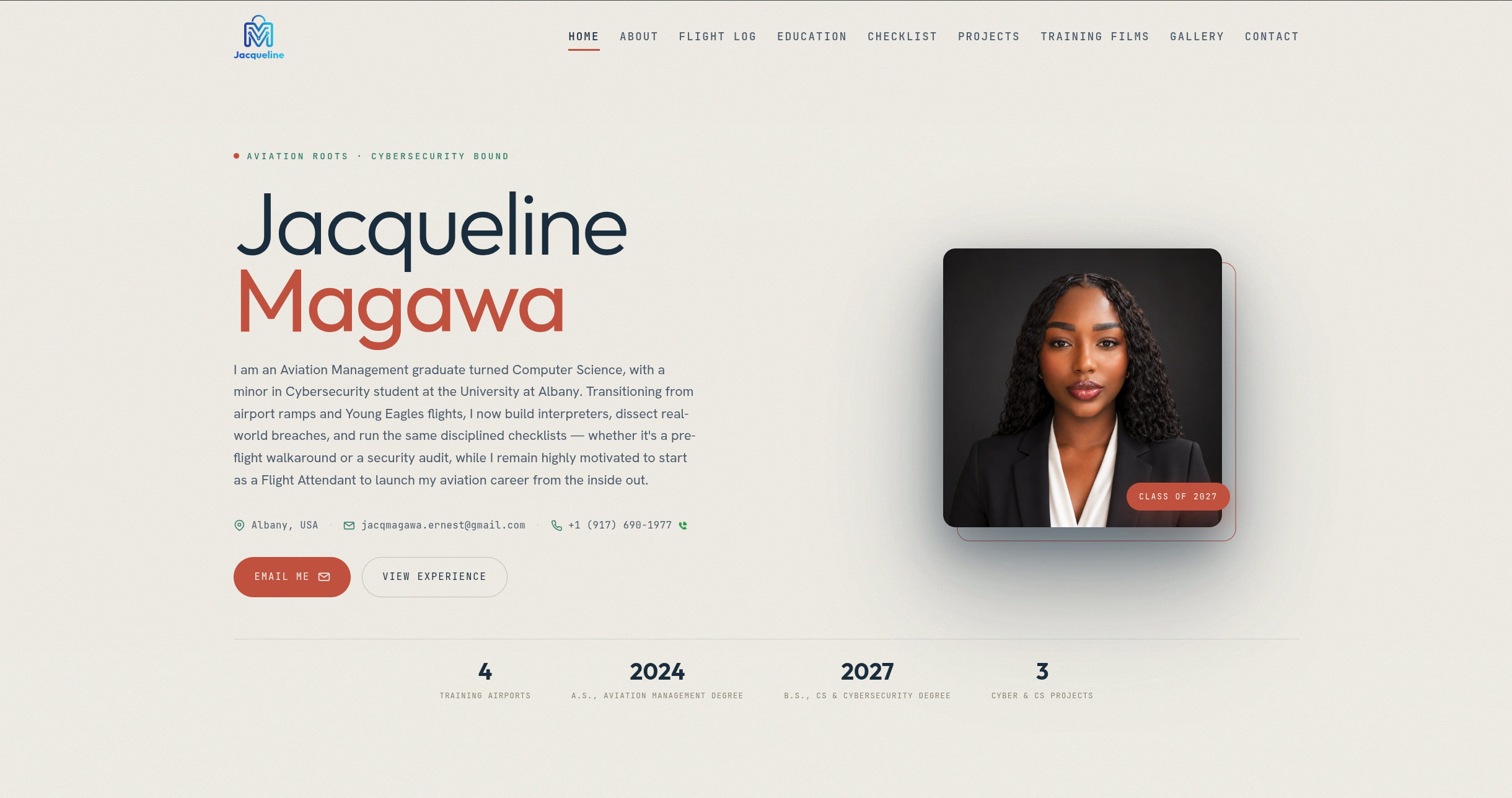
Results
Measured on the live static build (jacqmagawa.com). Lighthouse verifiable via PageSpeed Insights.
One person, two worlds
Most portfolios describe a single lane. Jacqueline Magawa's could not — and that was the entire challenge. She is an Aviation Management graduate who is now finishing a B.S. in Computer Science with a minor in Cybersecurity at the University at Albany. Her story runs from Young Eagles flights and airport ramps to building interpreters, dissecting real-world breaches, and running security audits.
The brief for jacqmagawa.com was deceptively hard: make those two worlds read as one coherent narrative, not two résumés stapled together. A visitor should land on the page and immediately understand that the aviation background and the cybersecurity ambition are the same story told in two chapters.
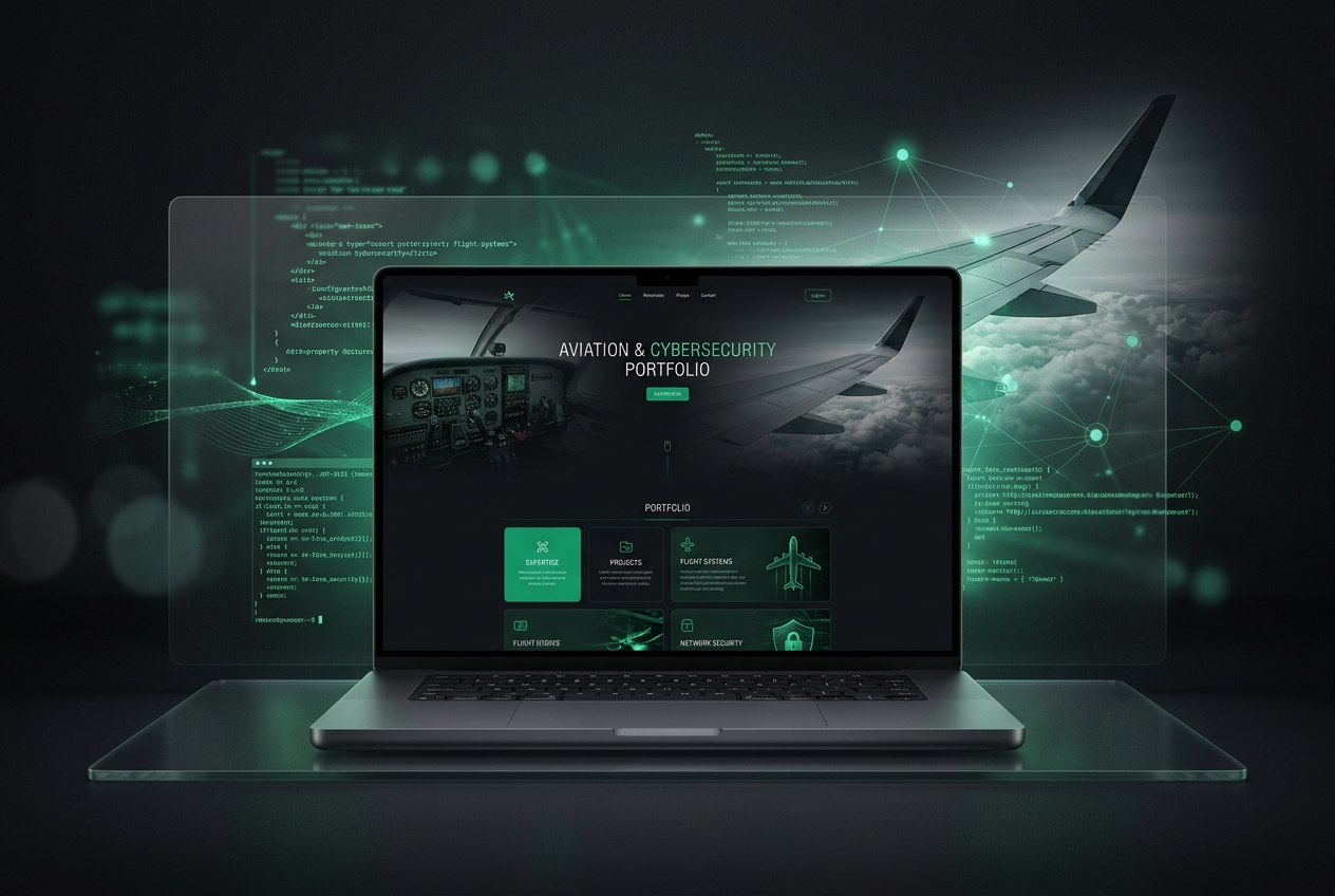 "The design-to-build concept — "Aviation Roots · Cybersecurity Bound."
This is the full design-to-build account of how that site came together.
Finding the throughline
Before choosing a single color or font, I looked for the connective tissue between flying and security. Jacqueline said it herself in a line that became the north star for the whole design:
Whether it's a pre-flight walkaround or a security audit, it's the same disciplined checklist.
That checklist mindset — methodical, calm, detail-obsessed — is the thread. Aviation taught it; cybersecurity rewards it. Once that was the anchor, every design decision had a test to pass: does this reinforce the idea of one disciplined mind moving between two fields?
The design language
The site had to feel technical and precise without turning cold. The decisions that got us there:
- A dark, cockpit-inspired interface as the foundation — it reads as serious and lets photography and video carry the color.
- A single restrained accent used only for calls-to-action and status cues, so nothing competes for attention.
- Generous spacing and glass-style cards, giving each section room to breathe like a well-organized instrument panel.
- Subtle motion — gentle reveals on scroll and a soft "scroll to explore" cue — to guide the eye without distracting from the content.
The goal was a page that looks like it was made by someone who sweats the details, because in both flying and security, the details are the job.
The architecture: a guided descent
The homepage is a single, scrolling story arranged so a recruiter can skim it in under a minute, or read every word if they want the whole journey:
- Hero — name, the "Aviation Roots · Cybersecurity Bound" positioning, a short first-person intro, portrait, and quick stat tiles (training airports, degrees, projects).
- About — the narrative from an eleven-year-old at a Young Eagles event to a Student Pilot to a CS/Cyber undergraduate, paired with a facts panel (graduation year, degrees, core tools, languages, location).
- Flight Log — the signature timeline (more on this below).
- Education — University at Albany and Dutchess Community College, with the relevant coursework surfaced.
- Certifications & Awards — FAA Student Pilot Certificate, EAA Young Eagles, and a Presidential Education Award.
- Skills — deliberately split into two clusters: Aviation & Service (customer service, bilingual English/Swahili, clear communication) and Technical & Cybersecurity (Java, C, Linux, threat modeling, networking, IT support).
- Projects — three pieces chosen to prove the pivot.
- Video & Photo galleries — the flight training, brought to life.
- Contact & Résumé — every way to reach her, plus a downloadable and previewable résumé.
The signature piece: the Flight Log
The most important design choice was turning a list of dates into a timeline styled after a pilot's logbook. Instead of a dry bullet list, the Flight Log walks chronologically from 2011 (first Young Eagles flight) through first taxi and takeoff rolls, mid-air training, a cross-country run from Farmingdale to Edgartown, and finally the 2021 FAA Student Pilot Certificate.
Each entry carries a date, a place, and a one-line story. The effect is narrative: you don't just read that she trained — you watch her progress climb, milestone by milestone. It mirrors exactly how pilots record their hours, which makes it feel authentic to anyone in aviation while remaining instantly readable to anyone who isn't.
Bringing the flying to life
A pilot's portfolio should let you feel the flying. The video gallery does that with a technique that keeps the page fast:
 Each clip opens from a lightweight poster like this one — the heavy video only loads when you click.
- Each clip is represented by a poster image with a muted, auto-playing preview — motion catches the eye without blasting sound.
- A "click for sound" lightbox opens the full clip on demand.
- Because the previews are lightweight posters and the heavy video only loads on interaction, the page stays quick even with a dozen clips on it.
The photo gallery follows the same principle: crisp thumbnails that expand into a full-screen lightbox, each with a short caption placing you on the ramp, in the cabin, or at cruising altitude.
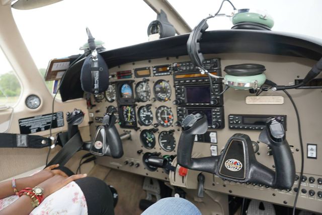 A photo-gallery thumbnail: walking through the panel before a training flight.
A privacy decision worth calling out
One detail matters more than it looks. The FAA Student Pilot Certificate is displayed — but with personal details redacted. For a portfolio that markets cybersecurity skills, that is not a small thing: it demonstrates the discipline. A security-minded professional should never publish a government document with sensitive fields exposed, and the site practices exactly what it preaches.
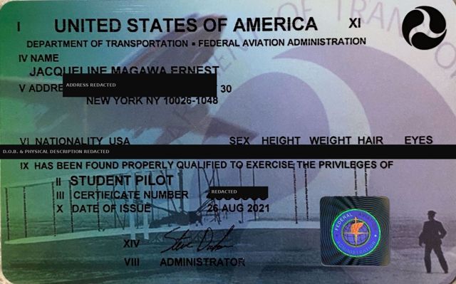 The certificate is shown as proof — with sensitive fields deliberately redacted.
Projects that prove the pivot
Three projects were chosen to show range rather than volume:
- Cybersecurity Tabletop Exercise (ROMERO Simulation) — evaluating ransomware, phishing, credential-leak, and supply-chain threats, then designing risk-based defenses within a fixed budget. This shows strategy.
- Interpreter for a Custom Programming Language — a full Java interpreter with a lexer, recursive-descent parser, and AST evaluator, built on a grammar designed from scratch. This shows engineering depth.
- SolarWinds Supply-Chain Attack — Case Study — mapping APT29's 2020 compromise with the MITRE ATT&CK framework, from Golden SAML to lateral movement and C2 evasion. This shows threat analysis.
Together they answer the recruiter's real question: can she think strategically, build real software, and reason about attacks? Yes, yes, and yes.
The stack — and why it's static
Under the hood, jacqmagawa.com is a hand-built static site: semantic HTML5, modern CSS, and vanilla JavaScript — no heavy front-end framework.
That was a deliberate choice, and the reasoning is the same checklist discipline applied to engineering:
- Speed. With no framework runtime to boot, the site paints almost instantly. The galleries and timeline are the only interactive parts, and they're driven by a small amount of focused JavaScript.
- Security & simplicity. A static site has a tiny attack surface — there is no server-side application to exploit and almost nothing to keep patched. For a portfolio, that is exactly right.
- Durability. Static files are cheap to host, trivial to cache at the edge, and effectively never go down.
- Progressive enhancement. The content is readable even before a line of JavaScript runs; the interactivity layers on top.
Sometimes the most impressive technical decision is choosing the least machinery that does the job well.
Performance, SEO, and delivery
A fast site is a courtesy to every visitor and a ranking signal to Google. The build leans on:
- Optimized poster images and lazy-loaded media so nothing heavy loads until it's needed.
- Semantic HTML with a clear heading hierarchy, descriptive
alttext, and a proper document outline. - A meta description and Open Graph tags so links render with a clean title, summary, and image when shared on LinkedIn or WhatsApp.
- A sitemap and Google Search Console verification (via the HTML verification tag) so the site is discoverable and indexable.
- HTTPS everywhere, served through a global CDN for edge caching and TLS.
Accessibility and responsiveness
The layout is mobile-first and reflows cleanly from a phone to a wide desktop. Lightboxes are keyboard-navigable and dismissible, images carry alt text, and the dark palette keeps text high-contrast and legible. Motion is used sparingly and tastefully, so the page feels alive without becoming busy.
Contact, résumé, and quiet spam defense
The contact section gives recruiters every path they might want: a form, direct email and phone, LinkedIn, GitHub, WhatsApp, and both a download and an in-page preview of the résumé. The form includes a honeypot field ("Website — leave blank") that real people never see but bots reliably fill in, letting the site drop automated spam without ever bothering a human with a CAPTCHA.
What I took away
The reason jacqmagawa.com works is that it refuses to hedge. It doesn't present aviation and cybersecurity as two unrelated hobbies — it argues, through structure and story, that they are the same disciplined mind applied to two cockpits. The Flight Log grounds the person; the projects prove the pivot; the static, secure, fast build quietly demonstrates the very competence the site is claiming.
Designing for someone whose passions intersect is a lesson in restraint: commit to the throughline, cut anything that muddies it, and let the details do the talking.
At a glance
- Type: Static personal portfolio
- Stack: HTML5 · CSS3 · vanilla JavaScript (no framework)
- Signature features: Logbook-style Flight Log timeline, muted-preview video gallery with click-for-sound lightbox, thumbnail photo gallery, honeypot-protected contact form, downloadable + previewable résumé
- Craft details: Redacted FAA certificate for privacy, Open Graph link previews, sitemap + Search Console verification, HTTPS via CDN
- Live at: jacqmagawa.com
This is Part 2 of the Design to Build series. Part 1 covers how I built magawa.website in React, and Part 3 compares the two approaches head-to-head.
Two portfolios, two philosophies
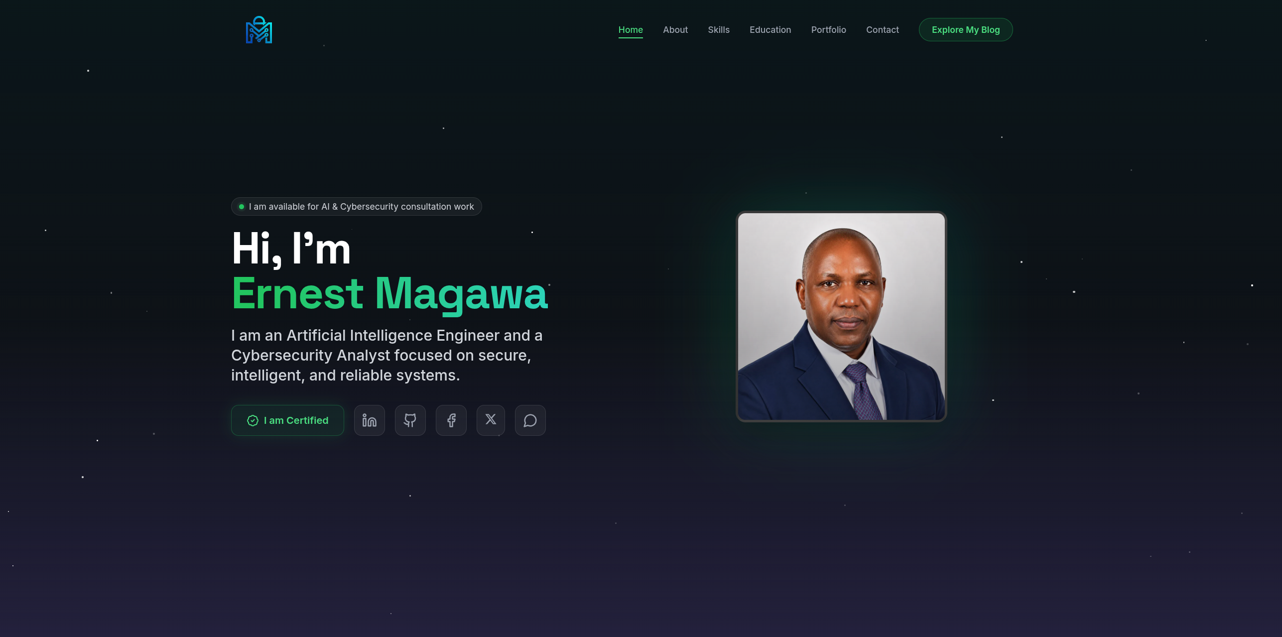
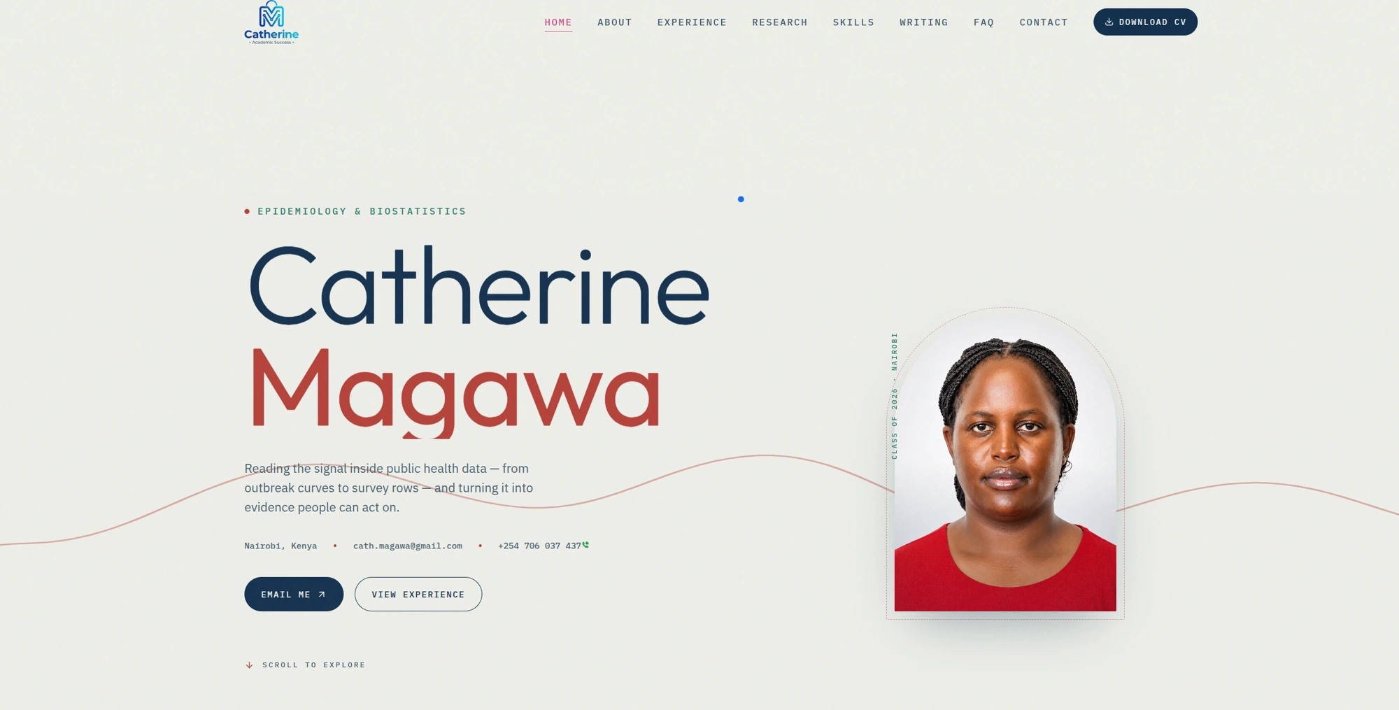
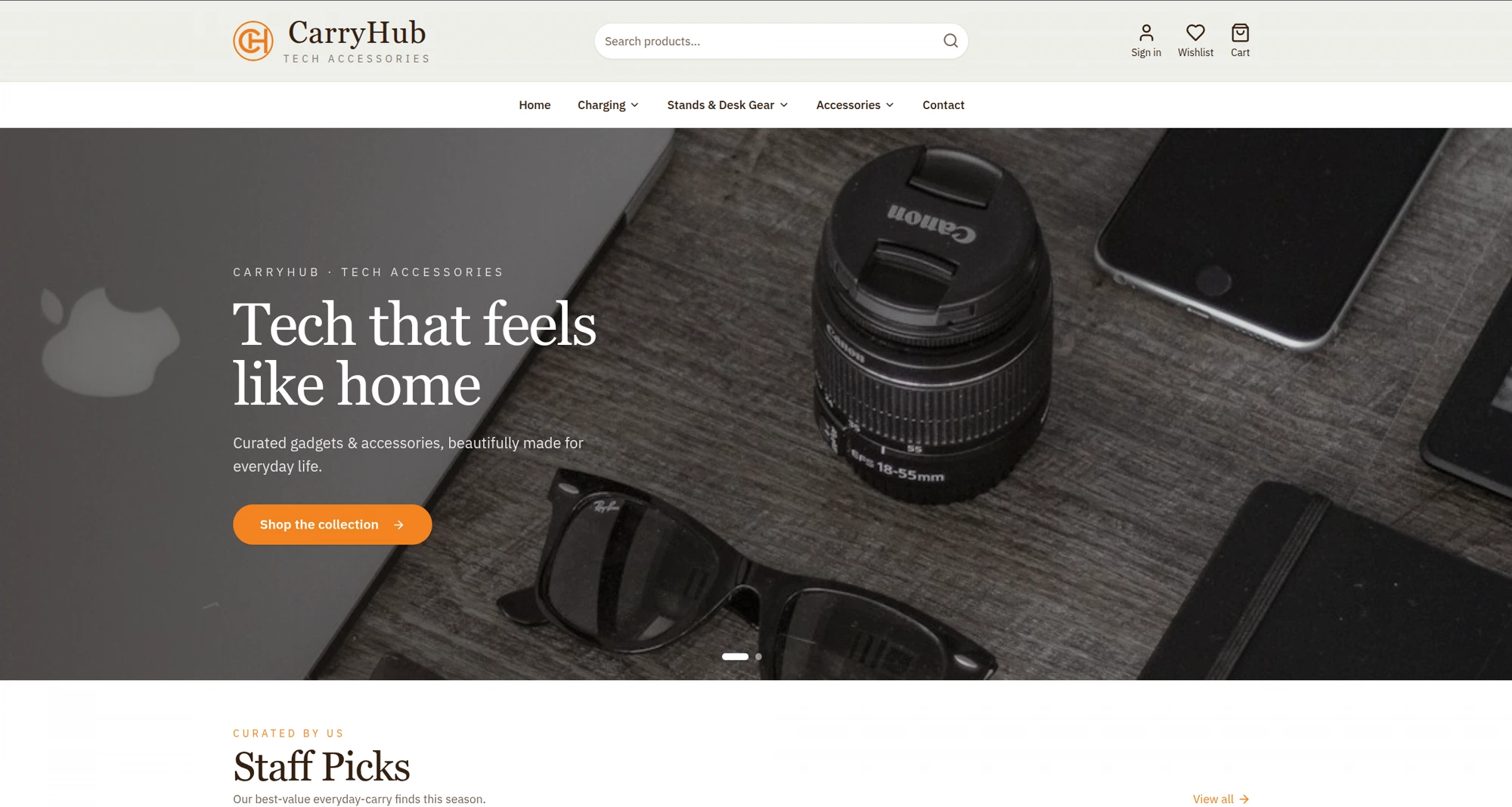
I recently built two personal portfolios back to back, and they landed on opposite ends of the web-development spectrum. jacqmagawa.com is a hand-built static site — semantic HTML, CSS, and a little vanilla JavaScript. magawa.website (this site) is a React single-page app backed by a FastAPI + MongoDB server.
Same designer, same dark aesthetic, two completely different engines. That contrast is the best possible teaching tool, so this post puts them side by side: what each approach is great at, where each one hurts, and how to choose.
The two builds at a glance
| jacqmagawa.com | magawa.website | |
|---|---|---|
| Type | Static site | React SPA + API |
| Front end | HTML5 · CSS3 · vanilla JS | React + Tailwind CSS |
| Back end | None | FastAPI (Python) |
| Database | None | MongoDB |
| Content updates | Edit files & redeploy | Log in to an admin dashboard |
| Dynamic features | Minimal (galleries, lightboxes) | Blog CMS, likes, newsletter, admin |
| Attack surface | Tiny | Larger (auth, API, DB) |
| Hosting | Static files + CDN | App server + database |
When static wins
For Jacqueline's portfolio, static was unquestionably the right call. Here's why:
- Speed out of the box. There's no framework runtime to download, parse, and boot before the page is usable. The HTML is the page.
- Almost nothing to attack. No login, no API, no database means the classic web vulnerabilities simply don't exist. For a public brochure site, that's a feature.
- It basically can't go down. Static files sit on a CDN edge. No server process to crash, no database connection to drop.
- Cheap and durable. Hosting is trivial and often free, and the site will still work untouched years from now.
The trade-off: every content change means editing files and redeploying. For a portfolio that updates a few times a year, that's a non-issue. For a blog that publishes weekly, it would be friction.
When a framework and backend win
magawa.website earns its extra complexity because it does things a static site can't:
- A real blog CMS. Posts, categories, tags, series, likes, and a newsletter are all managed from an admin dashboard — no code edits, no redeploys.
- Interactivity at scale. Filtering, search, pagination, live like/love counts, and reading-progress all benefit from React's component model and state.
- Server-side logic. Contact and newsletter emails, spam throttling, secure admin authentication, and scheduled digests all need a backend.
- Data that changes constantly. When content lives in a database, the site reflects edits instantly for every visitor.
The trade-off: more moving parts to secure, host, and maintain. Authentication, an API, and a database are power and responsibility.
Performance: it's not as one-sided as you'd think
Static has a natural head start — but a well-built React app closes most of the gap. On magawa.website that means code-splitting, lazy-loaded routes and images, responsive srcset images, and edge caching. The lesson: architecture doesn't excuse you from performance work, and it doesn't guarantee it either. A bloated static site can be slower than a lean React app. Discipline matters more than the label.
SEO: both can rank, with effort
A static site is SEO-friendly by default because the content is right there in the HTML. A React SPA has to work a little harder — magawa.website uses per-route metadata, canonical URLs, JSON-LD structured data, Open Graph tags, an auto-generated sitemap, and clean semantic markup so crawlers get everything they need. Both sites verify ownership in Google Search Console and ship a sitemap. Neither approach is a shortcut; both reward the fundamentals.
Maintenance and cost
- Static: near-zero ongoing cost, near-zero maintenance, but content changes require a developer's workflow (edit → commit → deploy).
- Framework + backend: a running server and database to pay for and keep patched, but the owner can publish and edit content themselves, forever, without touching code.
That last point is the real deciding factor more often than performance ever is: who needs to update the site, and how often?
A simple way to choose
Ask three questions:
- How often does the content change? Rarely → static. Constantly → framework + backend.
- Who updates it? A developer → static is fine. A non-technical owner → you want a CMS/admin.
- Does it need server-side logic (accounts, payments, email, live data)? No → static. Yes → backend.
Jacqueline's portfolio answered "rarely / developer / no," so it's static. This blog answered "weekly / owner / yes," so it's a React app with a real backend. Neither is more advanced than the other — they're answers to different questions.
The takeaway
The most senior instinct in engineering isn't reaching for the most powerful tool — it's matching the tool to the problem. Two portfolios, one designer, two right answers. If your site is a living, frequently-updated product, invest in a framework and a backend. If it's a fast, secure, rarely-changing showcase, a hand-built static site is not a compromise — it's craftsmanship.
This is Part 3 of the Design to Build series. See how each site was made: magawa.website in React (Part 1) and Jacqueline's static portfolio (Part 2).
From Design to Build: How I Built magawa.website
View in portfolioMore in Web Development

You might also like
Never miss a post
Get new cybersecurity and networking write-ups straight to your inbox. No spam — unsubscribe anytime.