
From Design to Build: How I Built magawa.website
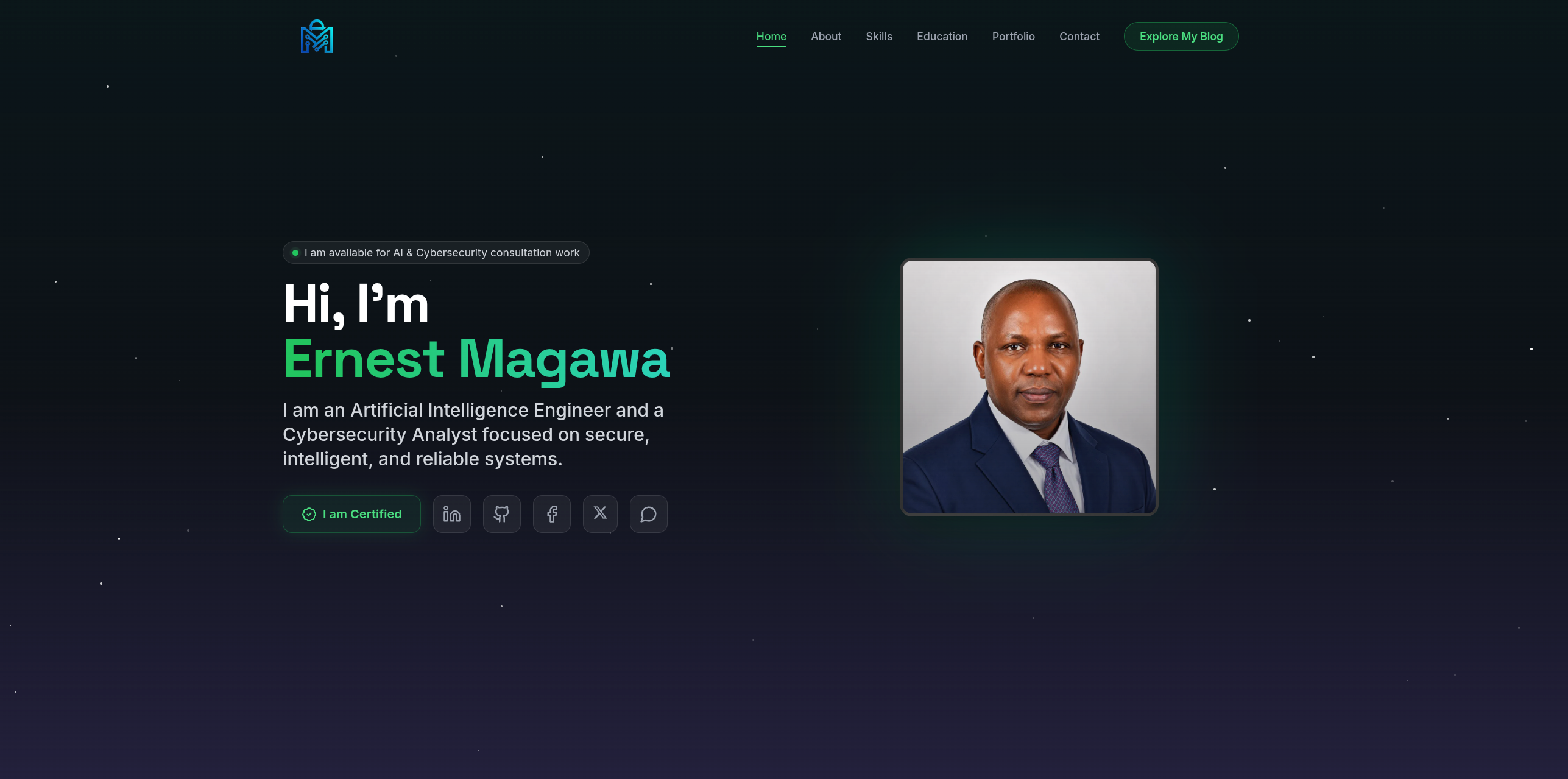
Every portfolio answers one question: can a visitor trust this person with something technical in the first five seconds? This is the full design-to-build story of magawa.website — turning a single brief into a fast, secure, dark-themed portfolio for an AI Engineer, Cybersecurity Analyst, and Network Engineer.
Why I built magawa.website
Every portfolio has to answer one question in the first five seconds: can I trust this person with something technical and important? For a site that represents an AI Engineer, a Cybersecurity Analyst, and a Network Engineer, the answer could not be left to chance. magawa.website had to feel serious, precise, and secure — the same qualities I bring to the systems I design and defend.
This is the full design-to-build story of my personal portfolio: how a single brief — make it read as competent, calm, and unmistakably security-minded — became a fast, responsive, dark-themed site that showcases my projects, certifications, and technical writing.
Defining the identity before the layout
Before any code, I decided what the site had to communicate. I work at the intersection of artificial intelligence, cybersecurity, and network engineering, so the design language needed to signal all three without feeling cluttered.
That led to a few early decisions:
- A dark interface as the foundation — it reads as technical and reduces visual noise around the content.
- A single green accent used sparingly for emphasis, calls to action, and status cues.
- Space Grotesk and Inter typography for a modern, engineering-forward tone.
- Generous spacing and glass-style cards so each section can breathe.
The goal was a site that looks like it was built by someone who cares about detail — because the details are the work.
Structuring the content
A portfolio only works if a visitor can find what matters quickly. I mapped the site into clear, single-purpose sections:
- Hero — who I am and what I focus on, with quick links to my certifications and profiles.
- About Me — my background across AI, cybersecurity, and infrastructure, plus a snapshot of experience, projects completed, and certifications.
- Tech Stack — the platforms and tools I actually use, from React and TensorFlow to Cisco, Splunk, pfSense, and Security Onion.
- Education & Certifications — my formal qualifications, including the CAIE and CompTIA CySA+ credentials.
- Projects — a filterable gallery across Networking, Cybersecurity, Artificial Intelligence, and Web Development.
- The Magawa Blog — long-form technical writing.
- Contact — a simple, secure way to reach me.
Deciding this structure first meant the build never turned into a pile of disconnected pages.
Choosing the stack
magawa.website is a single-page application built with React, styled with Tailwind CSS, and backed by a FastAPI service with a MongoDB database. That combination gave me three things I cared about:
- Speed — a React SPA transitions between sections instantly, with no full page reloads.
- Control — a component-based UI keeps everything consistent and easy to extend.
- A real backend — the blog, projects, contact form, and newsletter are powered by an API rather than hard-coded content, so I can update the site without redeploying.
Building the interface as components
Rather than coding each section from scratch, I treated the interface as a system of reusable parts: the navigation bar, hero, stat cards, project cards, filter tabs, blog cards, and the contact form. Each one lives in its own component and is reused wherever it's needed.
A project card, for example, is a small, self-contained unit:
const ProjectCard = ({ project, isNew, onOpen }) => (
  <button onClick={() => onOpen(project)} className="group rounded-2xl glass overflow-hidden p-4 text-left">
    <div className="relative aspect-video overflow-hidden rounded-xl mb-4">
      {isNew && <span className="badge-new">New</span>}
      <img src={project.img} alt={project.title} loading="lazy" className="object-cover group-hover:scale-110 transition-transform" />
    </div>
    <span className="text-green-400 text-xs">{project.category}</span>
    <h3 className="mt-1 font-semibold">{project.title}</h3>
  </button>
);
This approach paid off constantly. When I later added a keyword search, category counts, and a "New" badge to the Projects section, I only had to touch one component — every card updated at once.
Designing the layout system
Consistency matters more than flourish, so I defined the spacing, breakpoints, and grid behavior once and reused them everywhere. Tailwind's utility classes and CSS custom properties keep the visual rhythm identical across the whole site.
The Projects gallery is a responsive grid that adapts to the screen without any custom media-query juggling:
<div className="grid md:grid-cols-2 lg:grid-cols-3 gap-7">
  {projects.map((p) => <ProjectCard key={p.id} project={p} />)}
</div>
To keep long lists manageable, the gallery shows a few rows at a time with a Load more control, and a Show less control to collapse it again — small touches that keep the page calm no matter how much work I add.
Making it responsive and accessible from the start
Responsiveness was part of the build, not an afterthought. Every section was designed to stack cleanly on phones, expand on tablets, and use the full width on desktops. Buttons stay touch-friendly, typography scales sensibly, and nothing overflows horizontally.
Accessibility got the same treatment: semantic headings, visible focus states, descriptive alt text, proper labels on the contact form, and sufficient colour contrast against the dark background. Good structure is invisible to most visitors, but it's what makes a site usable for everyone.
The details that make it feel finished
A portfolio is judged on polish, so I invested in the small things:
- A custom cursor with a subtle trailing ring for a distinctive, tactile feel.
- Glass-morphism cards with soft blur and depth instead of flat boxes.
- Staggered entrance animations as sections scroll into view.
- Deep links that let a blog post point straight to the exact project it references.
None of these are essential, but together they make the site feel considered rather than templated.
Security and performance, because that's the point
For a security professional, a slow or careless site would undercut the whole message. So the build focused on both:
- Images are compressed, served in modern formats, and lazy-loaded.
- The contact and newsletter forms are rate-limited by IP to resist abuse.
- API documentation is disabled in production, and inputs are sanitised.
- Unused code and assets are kept out of the bundle to keep load times low.
Performance and security aren't features bolted on at the end — they're decisions made throughout the build.
Powering content with a real backend
Because the blog and projects are stored in MongoDB and served through FastAPI, the site stays fresh without a redeploy every time I publish. New articles, new projects, likes, and newsletter sign-ups all flow through the API. It also means the site generates a proper sitemap and RSS feed, which helps search engines and readers keep up with new writing.
Final thoughts
From design to build, magawa.website became more than a set of pages — it became a working demonstration of how I approach any system: define the intent clearly, build it as clean reusable parts, make it fast and accessible, and treat security and performance as first-class concerns.
If the site reads as competent and trustworthy in those first five seconds, then the design did its job — and everything behind it is built to back that impression up. A design may show boxes, text, and images, but developers must interpret those visuals correctly in code. Good structure is invisible to most users, yet essential to the quality of the site.
Styling with consistency in mind
Once the HTML structure is in place, styling brings the design to life. This includes colors, typography, spacing, shadows, borders, transitions, and responsiveness.
Consistency matters more than visual flair. A site feels professional when repeated patterns behave the same way everywhere.
Useful styling practices include:
- defining design tokens for colors and spacing
- using shared utility classes where appropriate
- keeping typography scales consistent
- limiting unnecessary custom variations
- organizing CSS by component or layout role
For example, CSS custom properties can help maintain consistency:
:root {
  --color-primary: #1d4ed8;
  --color-text: #1f2937;
  --color-background: #f8fafc;
  --space-sm: 0.5rem;
  --space-md: 1rem;
  --space-lg: 2rem;
  --radius-md: 10px;
}

body {
  color: var(--color-text);
  background: var(--color-background);
  font-family: system-ui, sans-serif;
}
This approach makes later revisions much easier. If the brand color changes, one variable can update the entire site.
Adding interactivity carefully
Most websites need some level of interactivity, but not every design element requires complex scripting. In this build, the focus should be on useful interactions that improve usability rather than effects that slow the site down.
Common interactive features include:
- mobile navigation menus
- accordions and tabs
- form validation
- modals
- image sliders
- theme toggles
- dynamic filtering
A simple mobile menu toggle might look like this:
<button class="menu-toggle" aria-expanded="false" aria-controls="main-menu">
  Menu
</button>

<nav id="main-menu" hidden>
  <ul>
    <li><a href="/">Home</a></li>
    <li><a href="/services">Services</a></li>
    <li><a href="/contact">Contact</a></li>
  </ul>
</nav>
const toggleButton = document.querySelector('.menu-toggle');
const menu = document.querySelector('#main-menu');

toggleButton.addEventListener('click', () => {
  const expanded = toggleButton.getAttribute('aria-expanded') === 'true';
  toggleButton.setAttribute('aria-expanded', String(!expanded));
  menu.hidden = expanded;
});
This is a small example, but it shows an important principle: interactive features should work clearly, predictably, and accessibly.
Making responsiveness a core requirement
Responsive design is not a final adjustment. It should be part of the build process from the start.
A website must work across:
- large desktop monitors
- laptops
- tablets
- mobile phones
- different browser widths
- varying input methods
Common responsive considerations include:
- stacking columns on smaller screens
- resizing typography appropriately
- adjusting navigation behavior
- ensuring touch-friendly button sizes
- preventing horizontal overflow
- optimizing image scaling
A frequent mistake is building only for desktop and trying to “shrink” the layout later. A better approach is to think in flexible patterns from the beginning.
For example:
.hero {
  display: grid;
  grid-template-columns: 1fr;
  gap: 2rem;
}

@media (min-width: 768px) {
  .hero {
    grid-template-columns: 1fr 1fr;
  }
}
This lets the layout grow naturally as screen space increases.
Accessibility during the build phase
Accessibility should be part of development, not an afterthought added near launch. During the building stage, developers have direct control over many of the factors that affect usability for people with disabilities.
Important accessibility checks include:
- proper heading order
- keyboard navigation support
- visible focus states
- sufficient color contrast
- descriptive link text
- form labels and error messages
- meaningful alt text for images
- ARIA usage only when necessary
For example, focus styling should never be removed without providing a replacement:
a:focus,
button:focus {
  outline: 3px solid #f59e0b;
  outline-offset: 2px;
}
Accessible development improves the site for everyone, not only for users with permanent disabilities. It also benefits mobile users, keyboard users, and people in constrained environments.
Performance matters while building
Website quality is not only about appearance. A site that looks great but loads slowly creates friction immediately.
Performance should be considered during development through decisions such as:
- compressing and sizing images properly
- minimizing render-blocking resources
- limiting heavy animations
- reducing unused CSS and JavaScript
- loading assets efficiently
- avoiding unnecessary third-party scripts
Even simple choices can make a difference. For example, using modern image formats and lazy loading can help reduce initial load time:
<img
  src="project-preview.webp"
  alt="Project preview"
  loading="lazy"
  width="800"
  height="600">
Building with performance in mind creates a better experience and often improves search visibility as well.
Testing throughout the build
Development should not wait until the end for testing. Every major page, component, and interaction should be checked during implementation.
Useful testing areas include:
- cross-browser behavior
- responsive layout checks
- accessibility audits
- broken links
- form behavior
- visual consistency
- performance measurements
Testing can be done through a mix of manual and automated methods. Examples include:
- browser developer tools
- Lighthouse audits
- keyboard-only navigation
- screen reader spot checks
- device emulation
- real device testing where possible
Catching issues early saves time. A small layout bug in one reusable component can quickly affect many pages.
Keeping the codebase maintainable
A website build is not just for launch day. It must remain understandable and editable in the future. That means writing code that other developers, or even your future self, can work with confidently.
Maintainability often depends on:
- clear file organization
- reusable component patterns
- predictable naming conventions
- comments only where necessary
- avoiding duplicated logic
- separating structure, style, and behavior cleanly
A maintainable project usually feels calmer to work on. Changes are easier, bugs are easier to isolate, and growth becomes less risky.
For example, a simple folder structure might look like this:
project/
├── assets/
│   ├── css/
│   ├── js/
│   └── images/
├── components/
├── pages/
└── index.html
The exact structure can vary, but the principle stays the same: organize the project so it can scale.
Bridging development and content
A build is not complete just because the layout works. Real websites depend on real content. During this phase, developers often need to make sure that components behave correctly with actual headlines, body text, images, and links.
This step helps reveal issues such as:
- text overflow
- inconsistent image dimensions
- awkward spacing with short or long content
- poor readability on smaller screens
- weak hierarchy when content changes
Placeholder text may look neat in a mockup, but real content rarely behaves so perfectly. Building with realistic samples creates a stronger final result.
Preparing for the next stage
By the end of this build, the design should no longer be a static idea. It should exist as a working, testable, responsive implementation.
At this point, the website should have:
- core layouts completed
- reusable components built
- styling applied consistently
- interactivity functioning
- responsive behavior verified
- accessibility reviewed
- performance considered
- content integrated or prepared
This creates a strong foundation for the next phase, which usually includes refinement, deployment preparation, final QA, and launch tasks.
Final thoughts
From design to building, the second stage of website development is where intention becomes execution. It is not just about coding pages until they resemble a mockup. It is about building a site that is structured well, performs reliably, adapts across devices, and remains usable for real people.
A successful website build combines visual accuracy with technical discipline. When development is handled carefully, the result is more than a finished interface. It becomes a dependable product that is ready for testing, growth, and eventual release.
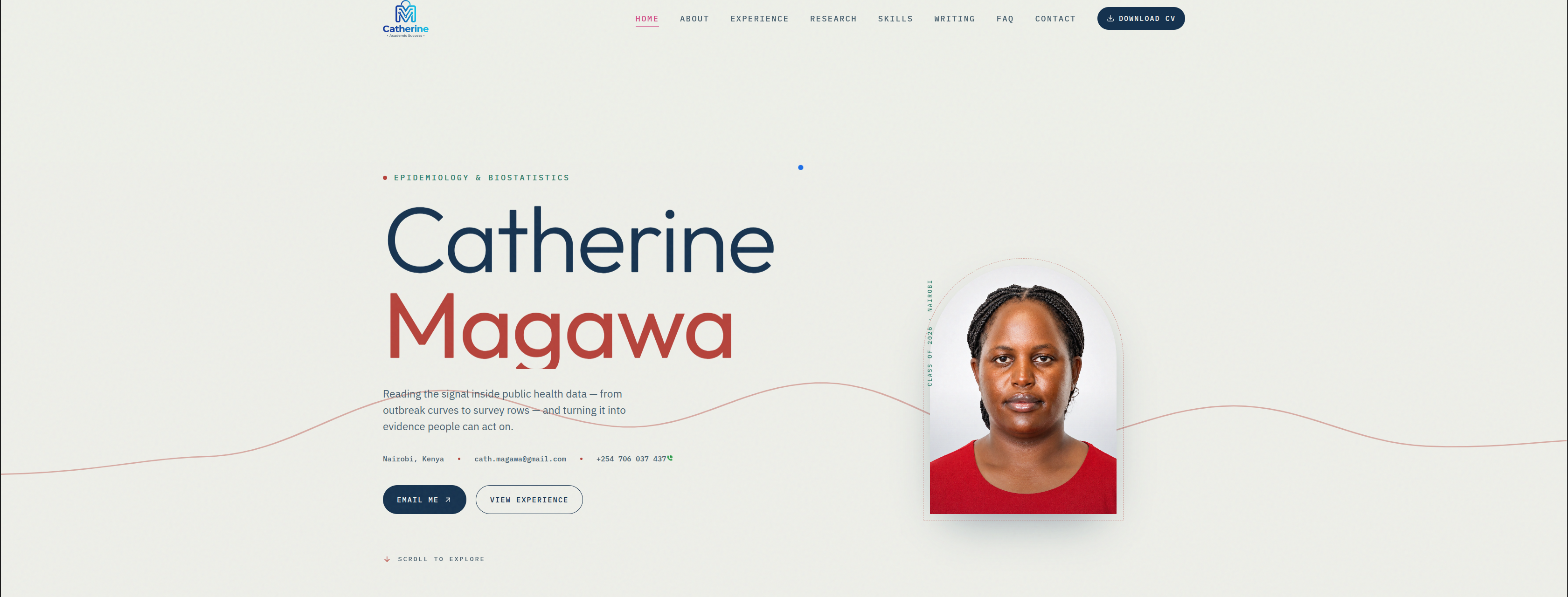
From Design to Build: Catherine's Personal Portfolio Website
View in portfolioMore in Web Development

You might also like
Never miss a post
Get new cybersecurity and networking write-ups straight to your inbox. No spam — unsubscribe anytime.