From Design to Build: Catherine's Personal Portfolio Website
A behind-the-scenes case study of designing and building cathemagawa.com — from a one-line brief to a shipped, responsive React portfolio for an epidemiologist.
Every portfolio starts with a question: what should someone feel in the first five seconds? For cathemagawa.com — the personal site of epidemiologist and biostatistician Catherine Magawa — the answer was calm, credible, and human. This is the story of taking that one-line brief and turning it into a shipped, responsive website, from the first design decision to the final line of code.
The brief
Catherine is a final-year Epidemiology & Biostatistics graduate finishing her degree in 2026, with internships across Kenya's Ministry of Health, the Kenya National Bureau of Statistics, and Kenyatta University Teaching, Referral & Research Hospital. She's looking for her first full-time role in public-health data — anywhere in the world.
So the site had two jobs:
- Establish trust fast. Recruiters in public health skim. The design had to read as serious and evidence-driven, not flashy.
- Tell a complete story. Not just "here's my CV," but the arc — who she is, what she's done, what she's researched, and how to reach her.
That framing drove every decision that followed.
Part 1 — Design
A palette that feels like a clinical, not a startup
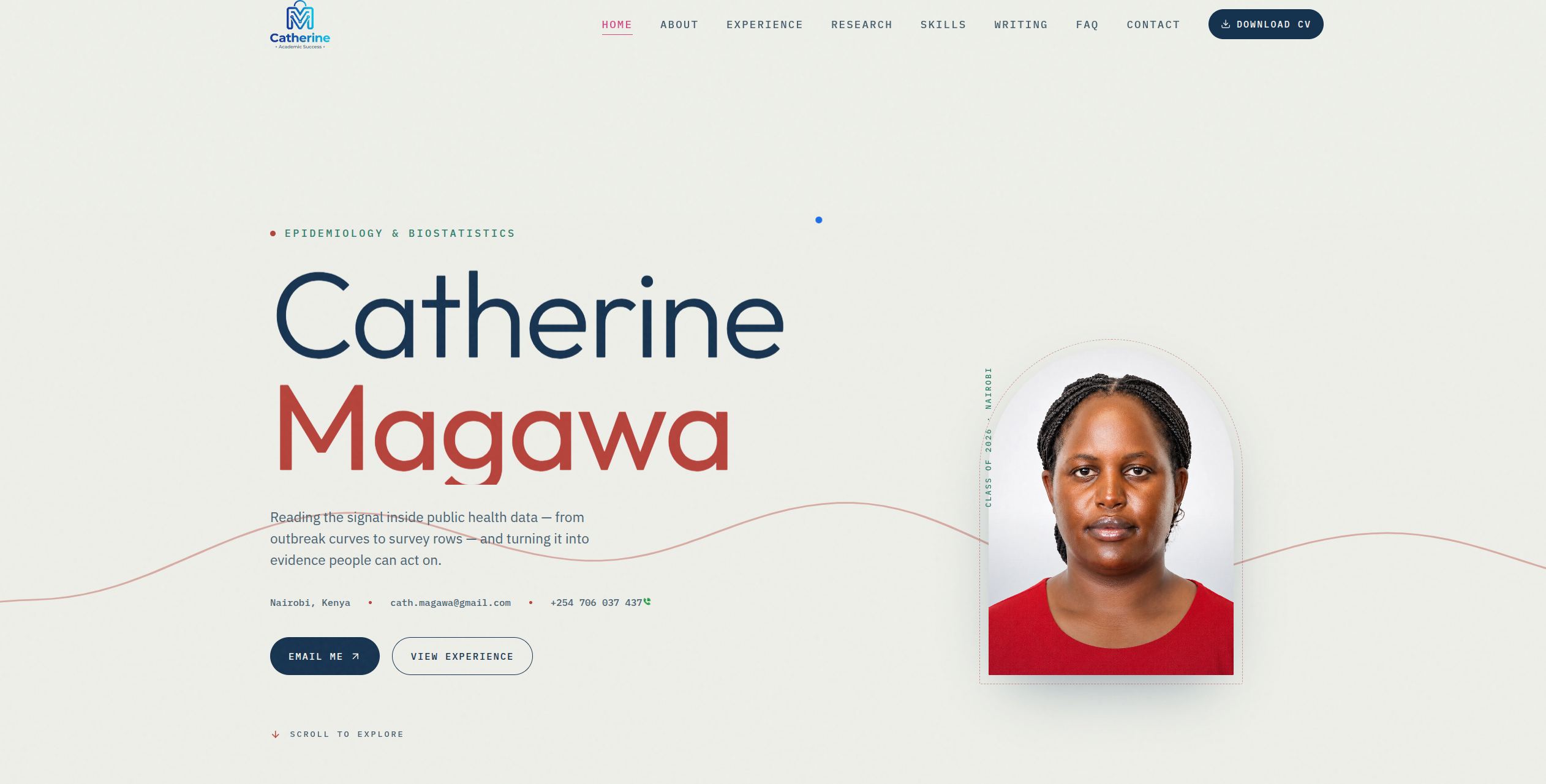
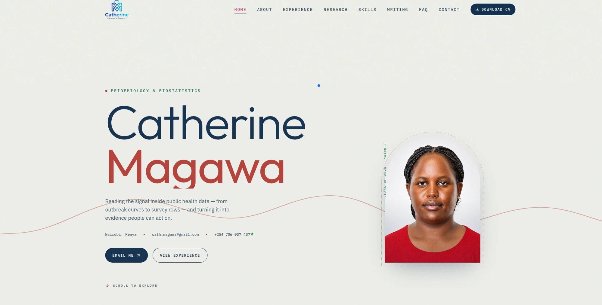
Most portfolios reach for a dark theme and a neon accent. For a public-health researcher, that would fight the message. Instead I built the whole site on a warm off-white canvas (#eef0e9) — the color of paper and lab notebooks — and used two purposeful accents:
- Deep navy for headings and structure (authority, focus)
- A muted red for the surname and key highlights (a single, confident pop)
- A soft green for section labels (a nod to health and growth)
The result reads as measured and academic. Nothing shouts; everything is legible.
Typography with a clear hierarchy
The hero pairs an oversized display treatment of "Catherine Magawa" — navy first name, red surname — with a quiet, sentence-case tagline: "Reading the signal inside public health data — from outbreak curves to survey rows — and turning it into evidence people can act on." The size contrast does the heavy lifting; the copy stays plain-spoken.
Structure: nine numbered chapters
Rather than a wall of sections, the page is organized as a numbered narrative (01–09), so scrolling feels like turning pages:
- Hero — name, tagline, location, and a portrait framed in a soft arch
- About — the profile, plus quick stat chips (graduating 2026, 3 internships, EBS · IDSR certified, core tools R & Excel)
- Experience — a clean vertical timeline of five roles
- Featured research — her lead-author undergraduate study on self-medication among students
- Education & credentials — degree plus EBS and IDSR certificates
- Leadership & community — the human side beyond the data
- Skills — grouped into research, surveillance, and communication
- Selected writing — short field notes and reflections
- Contact / FAQ — email, phone, socials, and a downloadable one-page CV
Small motion, big polish
A slow marquee of role keywords (Epidemiologist & Biostatistician · Evidence-based research · Disease surveillance · R · Nairobi · Open to roles worldwide) sits under the hero, and a thin hand-drawn wave line threads through the layout. These are deliberately subtle — enough to feel alive, never enough to distract from the content.
Part 2 — Build
The stack
The site is a single-page React application styled with utility-first CSS, deployed as a fast static front end. A SPA was the right call here: the whole story lives on one scrollable page with anchor navigation (HOME · ABOUT · EXPERIENCE · RESEARCH · SKILLS · WRITING · FAQ · CONTACT), so there's no page-reload friction as a recruiter moves through it.
Turning the design into components
Each numbered chapter became a self-contained, reusable component:
- The timeline renders from a simple data array, so adding a new role is a one-line change.
- The stat chips and skill groups are data-driven too — content and layout stay cleanly separated.
- The portrait uses a responsive
srcSetand lazy loading so it's crisp on retina screens without slowing the first paint.
Responsive from the start
The layout is built mobile-first. On phones the hero stacks (portrait above the name), the timeline collapses to a single column, and the marquee slows down. On desktop it opens into the asymmetric, editorial layout you see at full width. Every interactive target stays comfortably tappable.
Performance and SEO
Because public-health recruiters often arrive via a search or a shared link, the technical fundamentals mattered:
- A single, semantic
<h1>and a logical heading order down the page - Descriptive
alttext on the portrait and imagery - A real meta description and social-share preview
- Compressed, next-gen images (WebP) and minimal JavaScript so the page loads quickly even on a mobile connection in Nairobi
What I'd carry into the next build
A few lessons this project reinforced:
- Constraints make better design. One canvas color and two accents forced clarity.
- Content structure is design. Numbering the sections did more for readability than any visual flourish.
- Data-driven components pay off immediately. When Catherine lands a new role or publishes new writing, updating the site is trivial.
From a one-line brief to a shipped site, the throughline never changed: let the evidence speak, and get out of its way. You can see the finished result at cathemagawa.com.